Road by Juan Ramón Jiménez
They all are asleep, below.
Above, awake,
the helmsman and I.
He, watching the compass needle, lord
of the bodies, with their keys turned
in the locks. I, with my eyes
toward the infinite, guiding
the open treasures of the souls.
Saturday, 29 May 2010
CARLA SCOTT FULLERTON

'structural Pour' 2008
Wood, Paint and Cement
Her work is shaped by a sensitivity to materials and the ephemeral nature of all things monumental. Materials speak about the status and economies of a building. Structurally speaking, and is interested in the combined usage of old and new materials being used together to make new and more fluid contemporary formations. Working with industrial materials such as cement and steel, allowing materials to take on their own form. Devoid of their usual restrictions through the irregular and unpredictable processes of pouring, the work is deliberately imperfect, and free of the expected forms governed by the traditional notions of architecture.

Some of her work above that I saw at the Glasgow Sculpture Studios in 2009 :)
JENNY HOLZER

At MASS MoCA in 2008, Jenny Holzer presented her first interior light projections in the United States. The projections transformed the enormous, seemingly empty gallery in Building 5 into an engaging and provocative meeting place flooded with words, bodies, and light.
http://www.massmoca.org/projections.php
A pre-recorded video of Jenny Holzer's PROJECTIONS
with poetry by Wislawa Szymborska.
The text that was on display in PROJECTIONS:
Selected poems from View with a Grain of Sand and Poems New and Collected: 1957-1997copyright © 1993, 1998 by Wisława Szymborska
Holzer has also exhibited her 'projections' all over the world, below are more images of these in Chicago, London and Rio De Janeiro.


Saturday, 22 May 2010
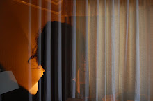
flipping horizontal


100 odd images to flip horizontal so I can print them
onto wood using acrylic gel medium
i.e.
Thursday, 20 May 2010
momentary printing
Many of the materials for Mr. Rauschenberg’s found-object wizardry came directly from the sidewalks, gutters and trash bins of New York. Most of the images he used were lifted from its magazines and newspapers and mirrored the look and pulse of urban life.

'Scrape' 1974
Transfer of offset lithographed and newspaper images, collage of paper bags and fabric. China silk and silk chiffon.
Robert Rauschenberg thinks that anything—cardboard, tires, light bulbs, photographs, old clothes, even dirt—can be used to make art.
If people can paint on canvas, why can't they paint on the canvas of an old sneaker? he wondered. And do they have to use paint at all? He was curious about this, and so he began experimenting with different materials, to see how they would work.
Many people have noticed the joy and energy in Rauschenberg's artwork. He says it comes from this kind of curiosity. He is curious about everything!

'Reservoir' 1961
oil, wood, graphite, fabric, metal, and rubber on canvas
In Reservoir a length of wood, two clocks, and a couple of cast-off wheels reach out from the painted surface into the viewer's space. But these elements do not add up to a single meaning. Instead, they convey both the randomness and order that Rauschenberg saw in everyday life. The arrangement of objects and thick, splashy brushstrokes represent his split-second decisions, and the two clocks precisely record when he started the work and the moment he considered it finished. The rebelliousness of the beats led to the pop art of the 1960s, and for decades thereafter, Rauschenberg made light of himself as "Poppa Pop."
He is curious about what other artists are doing. He often works with friends who are artists and writers.
He is curious about technology. Rauschenberg was especially excited about new methods of printing and photography—even X-rays. He asked master craftsmen to help him use these technologies in his artwork.
He is curious about the world. Rauschenberg likes to put things he finds—like clocks and wheels—in his paintings. "I think a painting is more like the real world if it's made out of the real world," he said.
Saturday, 15 May 2010
osb board - love it!

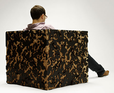
The Camouflage Armchair was designed by Mexican Designer Emiliano Godoy for the Mexico City based manufacturer Pirwi. “Camouflage” is a low armchair made in Oriented Strand Board (OSB). The material is surfaced with a stained-black veneer, and has oversized lateral panels that partly hide the user. These panels feature a carved camouflage pattern that emphasizes the trench-like character of the piece, but at the same time expose the OSB beneath.
more osb - painted black


Monday, 10 May 2010
Ed Ruscha

Union, Needles, California
Twentysix_Gasoline_Stations
Dated 1962 in the foreword and dedicated to Patty Callahan, the book comprises twenty-six photographs of various different dimensions and proportions; most are laid out on a single page with the text facing the image; some go across the double spread, a few are placed next to each other. Three images are taken at night, including one of Tucumcari, New Mexico, that appears to have been taken from a moving car. But for three people walking across the forecourt on the Sunset Strip, a man getting out of his car at Flagstaff, Arizona and a man looking under his hood at Lipton, Arizona, there are no people present. There aren't even any cars visible in some of the photos. Almost all of the photos are taken from the other side of the highway.
All of the gasoline stations are on Route 66, a road that had already been mythologized by the TV series Route 66 and in Steinbeck's The Grapes Of Wrath, and later reappeared as a motif in Dennis Hopper's Easy Rider. The order that the stations appear is almost the same as their position on the route west-east, with five stations moved out of order. With the exception of the last station in Groom, Texas, the relevant states listed are all in order.
"I have eliminated all text from my books- I want absolutely neutral material. My pictures are not that interesting, nor the subject matter. They are simply a collection of 'facts', my book is more like a collection of readymades." ED RUSCHA

Originally, the book was received poorly; despite being published the same year as Ruscha's first exhibition at the Ferus Gallery, Los Angeles-which also represented Andy Warhol- the book was rejected by the Library of Congress for its 'unorthodox form and supposed lack of information'. The book gradually acquired cult status through the sixties, and by the eighties was often being hailed as the first modern artist's book although in fact Dieter Roth's artist's books share the same mass produced aesthetic and investigate the nature of books with at least as much formal vigour, and predate Ruscha's first publication by 7 years. Additionally, Warja Lavater's first book, William Tell (New York : Junior Council, Museum of Modern Art, 1962 (OCLC 10911288), an accordion folded book written using symbols only, preceded Ruscha's Twentysix Gasoline Stations.
An original signed copy of Twentysix Gasoline Stations is now worth up to $35,000

'Standard Station' 1966. Screenprint, composition: 19 5/8 x 36 15/16" (49.6 x 93.8 cm)
james davis (us artist)


Coin Collection, 2005
Graphite rubbing on paper
16" x 16"


Message Mountain, 2007
Outdoor reader board with letters, acrylic glue
40" x 72" x 10"
www.jamesdavisart.com/
new map art by chris kenny


Philosophy can damp down the hottest flames of lust 2009
Construction with found text
29 x 29 x 3 inches

yellow map 2007

observatory 2007

nonsuch (white map circle) 2008
creating new pieces made from cutting maps and rearranging them into unusual collages

1,329 Children 2009
Mixed media construction with found photographs
29 x 29 x 3 inches
Saturday, 8 May 2010
.JPG)

.JPG)

Thursday, 6 May 2010


Tuesday, 4 May 2010
Paul Fujita - acrylic gel transfers
What is a transfer?
A transfer is any process that takes a printed image, and removes it from whatever it is on, and then transfers it to another surface.
The story goes, that once upon a time, Robert Rauschenberg, the great American painter, was in his studio messing around and he spilled paint thinner onto a canvas that had a magazine page sitting on it. I think he may have let it sit for a while, but when he went to pick up the page, the image had been melted by the solvent and reproduced itself onto the canvas! Voila! The modern transfer was born, or something like that.
In 1991, when I was a freshman at PSU, I had the opportunity to study under Mel Katz. We did various abstract techniques that were very direct and fast. One of these was the transfer. We used some intense paint thinner that was only available at this obscure store. We taped magazine pages face down onto paper, then brushed on some solvent, then rubbed it with the edge of a spoon, then - bingo- the image was on the paper. This was great, we got some cool results, but my problem then and now is that I don't like poisonous chemicals. If you think you are cool, gnarly or smart, go for it. Be the romantic artist whose studio apartment is soaked in toxic garbage and breathe all of the poisonous fumes you want. You can use Goof Off, lacquer thinner, lighter fluid, or even xylene blending pens to make your transfers, I just honestly don't think its worth it. But whatever the case, this class introduced me to principles of abstraction and transfers.
I had heard about acrylic transfers but I had never seen one done before 1997 or so. The process wasn't exactly clear, and there were several different methods used. One of these is the commonly known method that involves building up the acrylic on the photocopy until it is thick and then soaking it in water so the paper falls off. This is good but it takes too long in my opinion. So I experimented on my own for a couple of years until I came up with an easy, quick method to do transfers.

gesso and acrylic transfers onto wood. Fujita '02
What makes a transfer work?
When a transfer succeeds, it is a firmly fused layer of medium that is bonded quite well to an image that consists of photocopy toner. What is it about acrylic and toner that causes them to stick together so well? I posed this question to my father, retired chemist Tom S. Fujita, and got a long and complex answer. Basically the acrylic is an emulsion, which explains why it starts out like liquid and then dries up like a flexible plastic. When it is wet, the molecular structure of the emulsion is desperately grabbing out for something and so when the water evaporates, they bond to each other or whatever is next to them. Thus - voila - your paint sticks to the canvas. So then you take a photocopy, which is made from toner, and expose it to acrylic, and they bond together. Tom felt that on a molecular level, the emulsion is melting the toner, however there are never any visible smears or blurs unless you use a computer printout which kind of works but not really. At any rate, this would appear to lend to theoretical archivability but who knows? Maybe you have a better explanation which I would be curious to hear.
Why do a transfer?
It is, in my opinion, the best way to put an image onto a surface. How would one go about putting a transparent image onto another image? You'd have to use a computer or make a transparency. What about adding an image to a painting? Well of course you could just collage it on there, but unless you use special materials its just going to look like crap and disintegrate within a few years. All of these problems can be solved using a transfer. The result is a collage effect with the physical stability of a painting.

This is a photocopy transfer drawing on printmaking paper. I used dozens of copies and gel medium and that's it. The surface is totally flat.
Fujita '98
Subscribe to:
Posts (Atom)